


Get Started
A streamlined library of ready-to-use UI components designed to help teams build websites and digital services faster.


Typography
Defines a clear hierarchy and improves readability across all interfaces.

Color System
Creates visual harmony and reinforces Sharjah’s identity across all products.

Iconography
Delivers clear, modern symbols that enhance understanding and guide user actions.

Layout and spacing
Establishes structure and balance, ensuring content feels clear, organized, and easy to follow.

Input & Fields
Standardizes form elements to ensure smooth, clear, and accessible data entry.

Buttons
Provide clear actions and guide users through tasks with consistency and ease.

Accessibility
Ensures every design is usable and inclusive for all individuals, regardless of ability.

Responsive
Adapts seamlessly to different screen sizes, ensuring a smooth and consistent experience across all devices.

Content Design
Ensures every design is usable and inclusive for all individuals, regardless of ability.

Header
A top navigation bar containing the organization logo, primary links, and quick actions.

Breadcrumbs
A navigation element that shows the current page location within the site hierarchy.
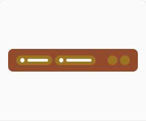
Sticky Bar
A persistent bar that remains visible while scrolling, keeping key actions within reach.

Footer
A structured footer that provides essential links and information in a consistent layout.

Banners
Prominent messaging areas used for announcements, promotions, and important alerts.

Content Blocks
Structured text blocks that organize headings and body copy for comfortable reading.

Cards
Flexible containers that group related content and actions in a compact, scannable format.
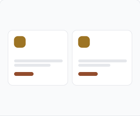
Services
Card layouts for presenting government services with clear titles and quick entry points.

Filters
Controls that let users refine lists and search results by category or attribute.
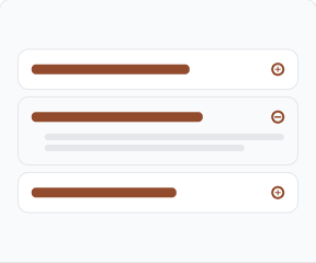
FAQs
Expandable question-and-answer sections that surface helpful information on demand.
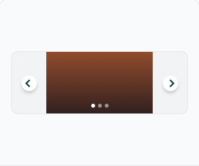
Media Carousel
A slideshow for cycling through images and media with intuitive navigation controls.

Gallery
A responsive grid for presenting collections of images and visual media.

Pagination
Navigation controls for splitting long lists of content into manageable pages.

Tables
Structured rows and columns for comparing and scanning detailed data sets.
Tabs
Switchable panels that organize related content within a single view.
Badges
Compact labels that highlight status, categories, or counts at a glance.

Stepper
A progress indicator that guides users through multi-step processes.

Statistics
Numeric highlight blocks that showcase key figures and achievements.

Website Templates
Ready-made page layouts that help teams build websites faster and more consistently.

Dashboard Template
Pre-built dashboard structure that helps teams present metrics and analytics efficiently.

Login Template
A simple, secure login layout designed for quick user access.

Under Maintenance
Consistent maintenance layout that keeps users informed during service interruptions.
